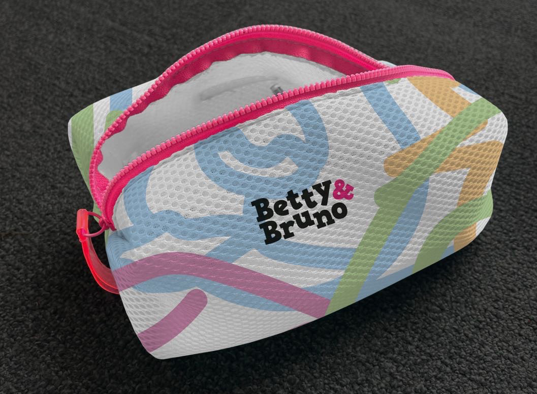
A rebrand for a new pet care company called Betty & Bruno. We were tasked with creating a new brand identity which considered narrative and the touch points for the brand.
Danielle Julien
This was a live brief where the characters of Betty and Bruno where key to the storytelling of the brand. The company sell natural, sustainable pet care products like shampoo, paw balm and brushes. This was an exciting project where I could demonstrate my passion for storytelling when designing branding, and I enjoyed working collaboratively to produce our outcomes.
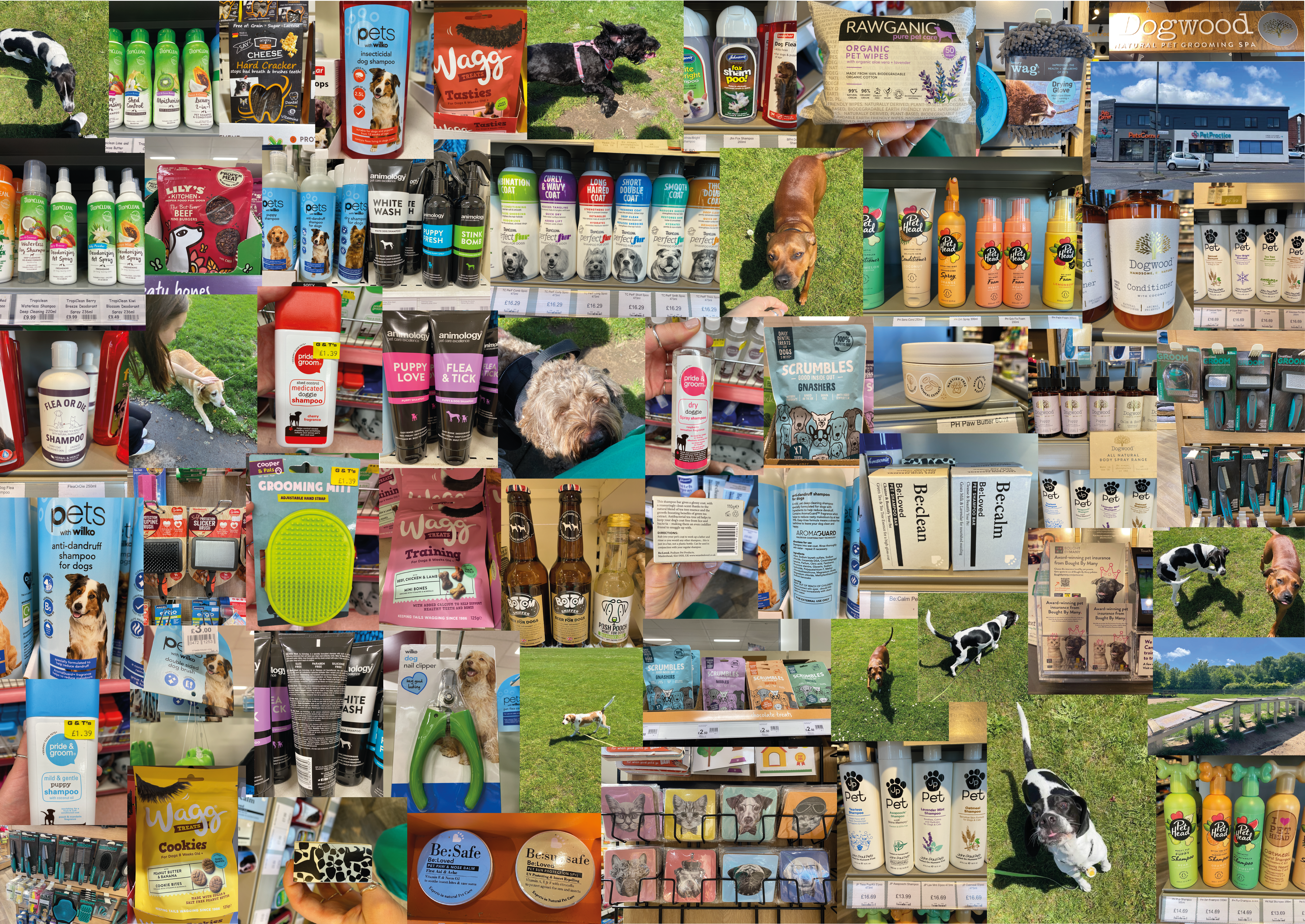
To start, Danielle and I visited local pet shops, a dog park and groomers to understand what is already on the market and how dogs act and interact with their owners. We also visited a therapy dog charity to immerse ourselves in a key aspect of the brief. This primary research provided some key insights which drove our project.
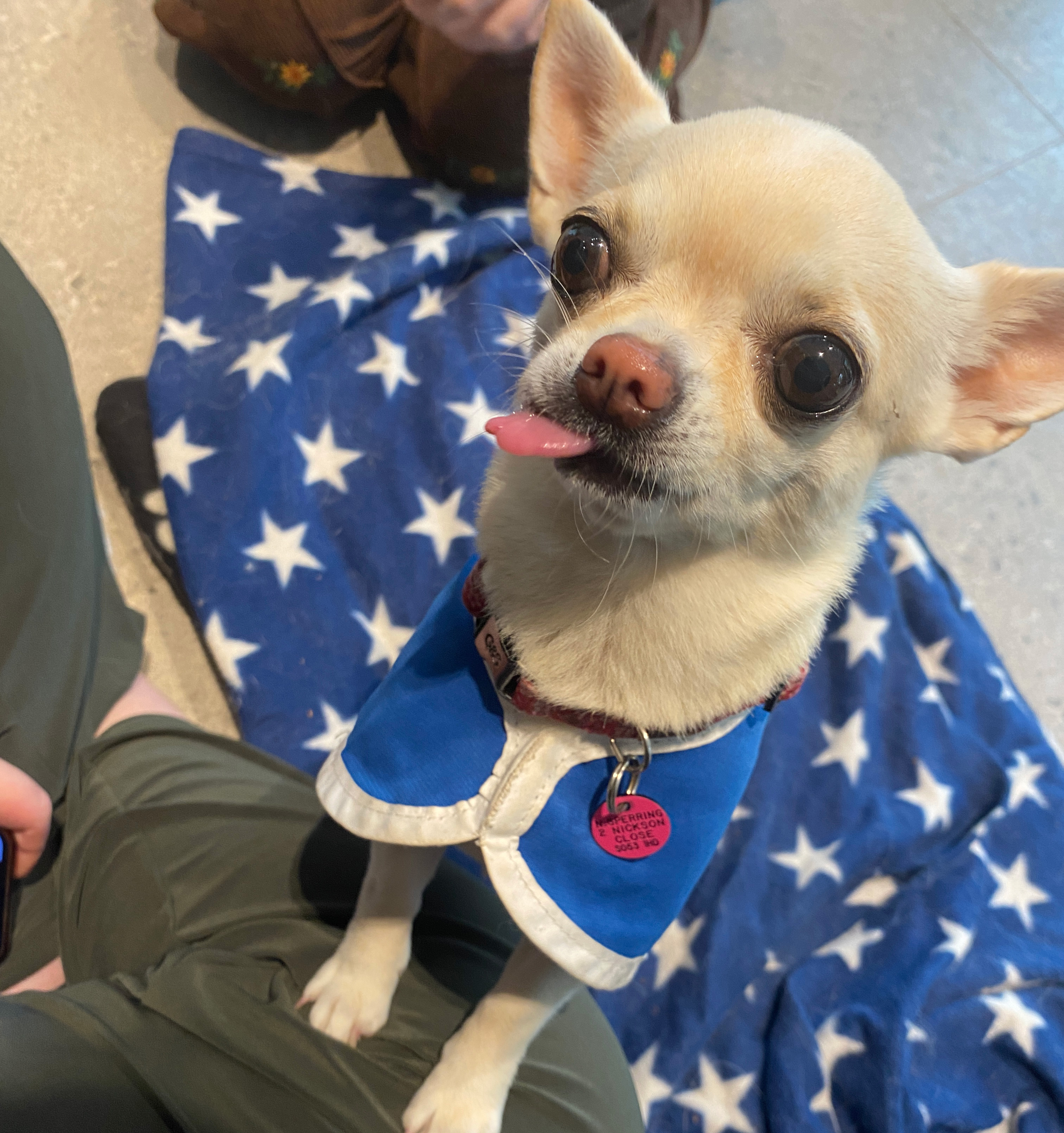
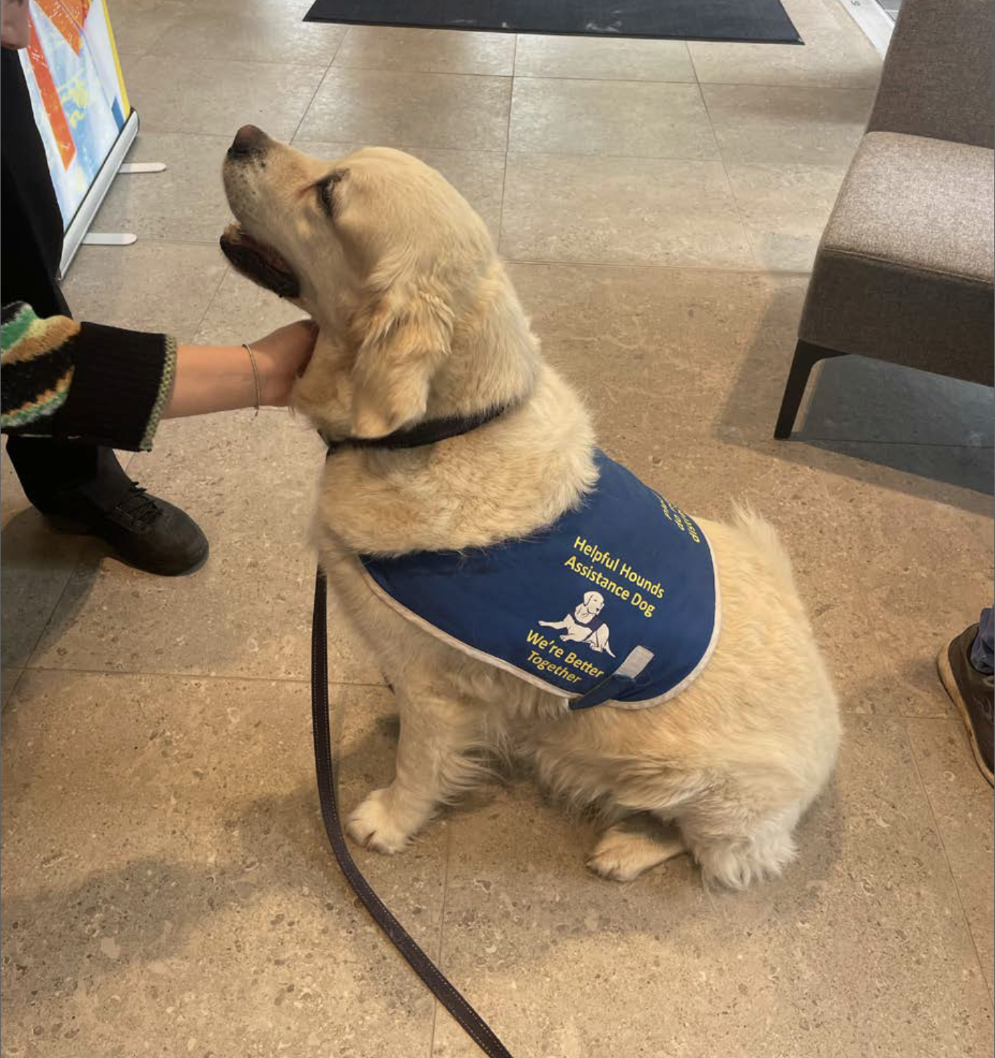
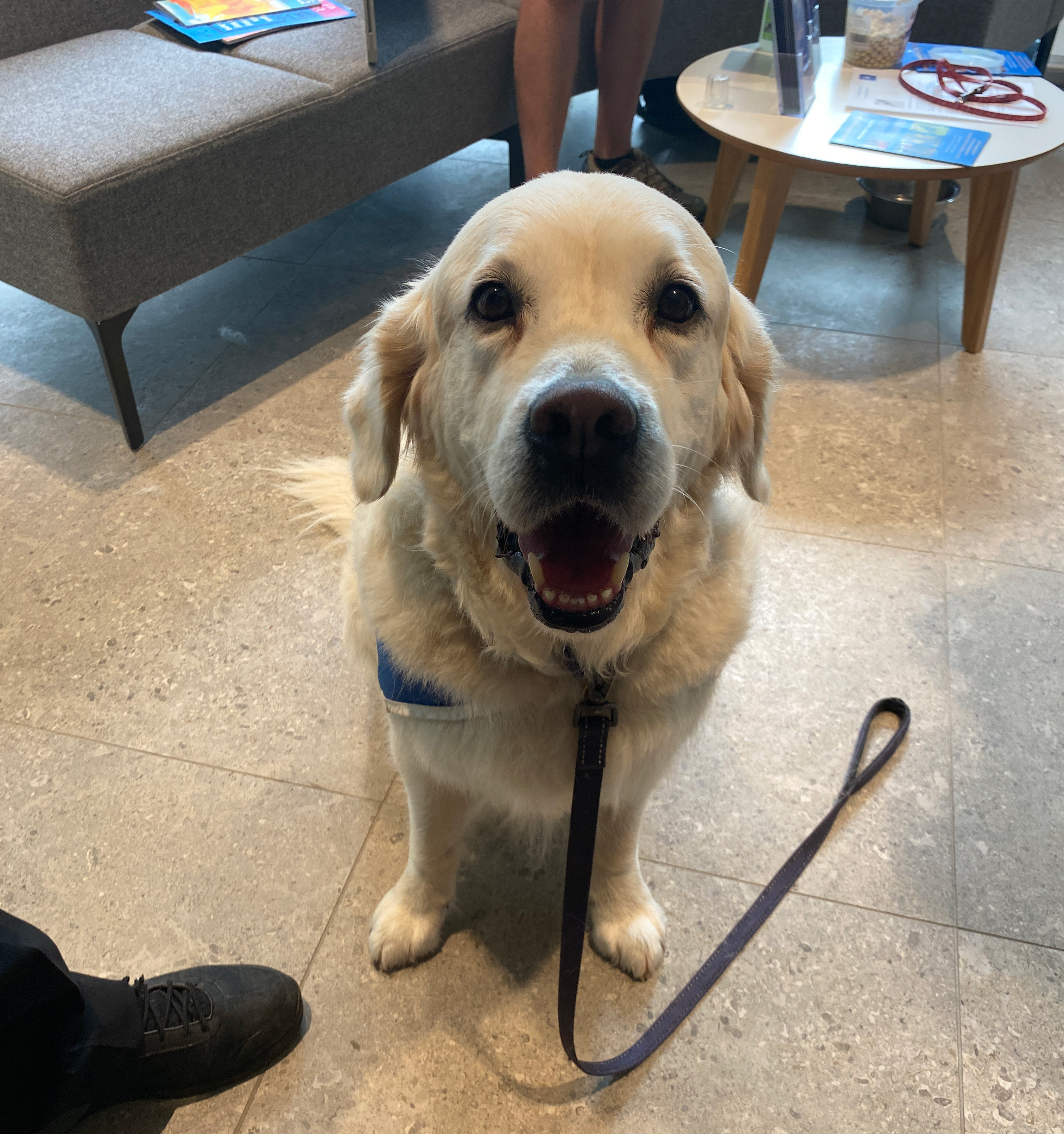
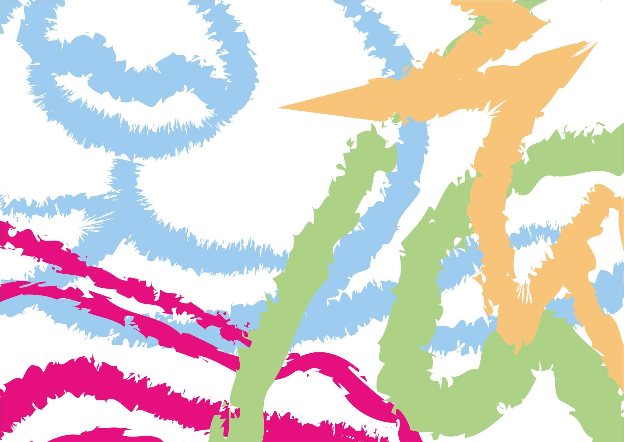
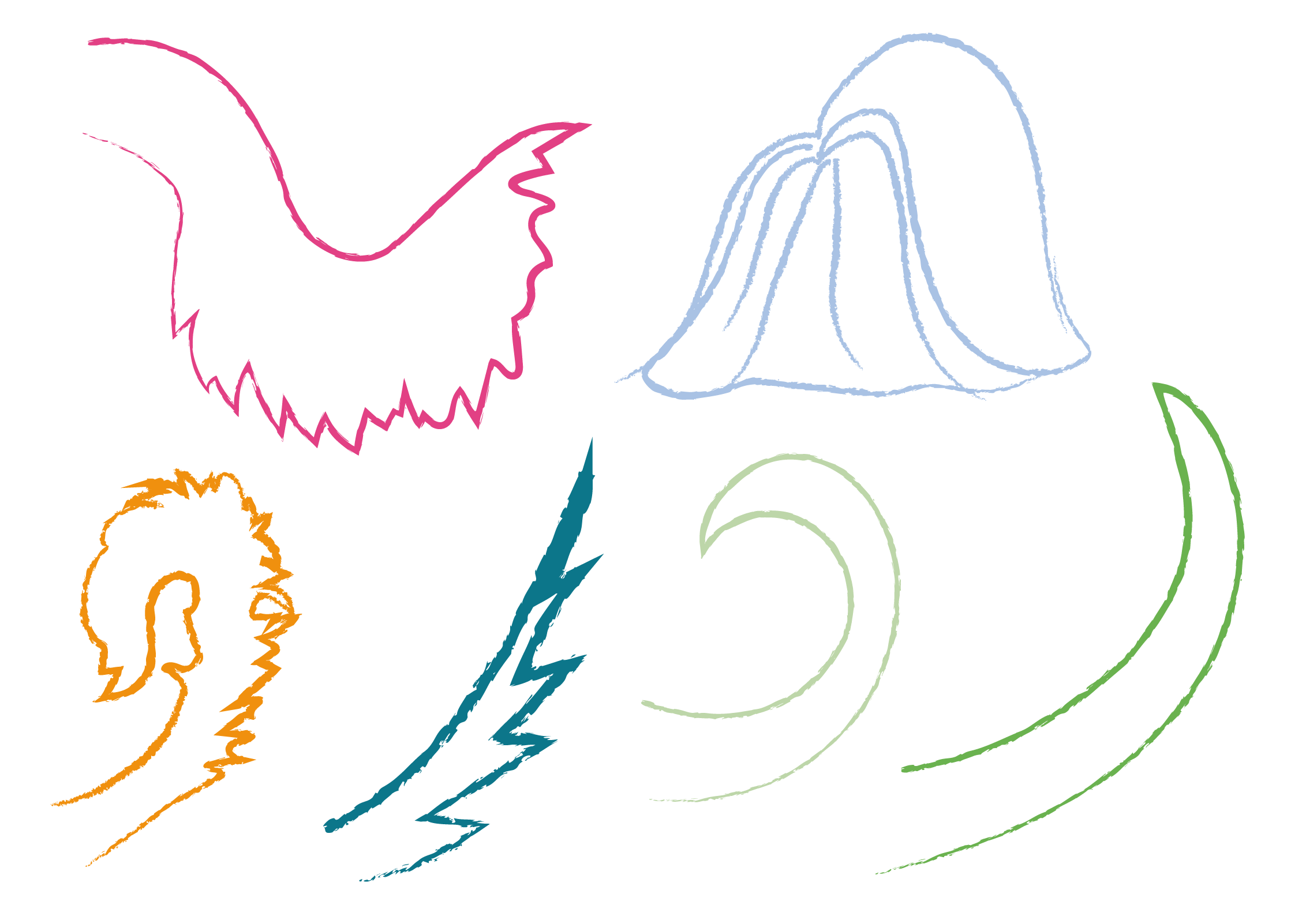
One key insight which we observed was that photographing most dogs is a challenge due to their constant movement and high energy levels. We used this concept and sketched the therapy dogs in a charcoal stroke to imitate movement and hair like texture. We created a range of initial brand concepts, looking at different colour combinations and typographic choices. The colours we were using were ones dogs can distinguish more easily.
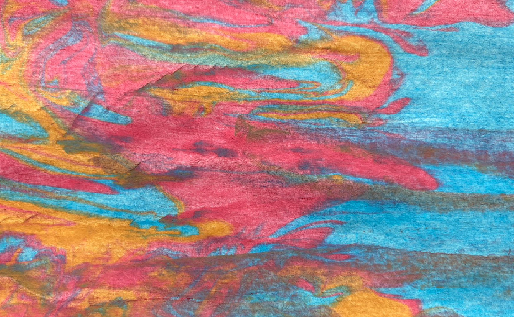
A key component of the brief is to give the dogs Betty and Bruno a character, creating a playful and modern brand identity. We played around with concepts where the dogs are talking and used colour and arrangement of the dog illustrations to dictate a narrative. I had the idea to create a design using coloured paint and a comb, as it's a dog hair care brand, but the finished result we both felt wasn't suitable for the brand we'd started to develop.
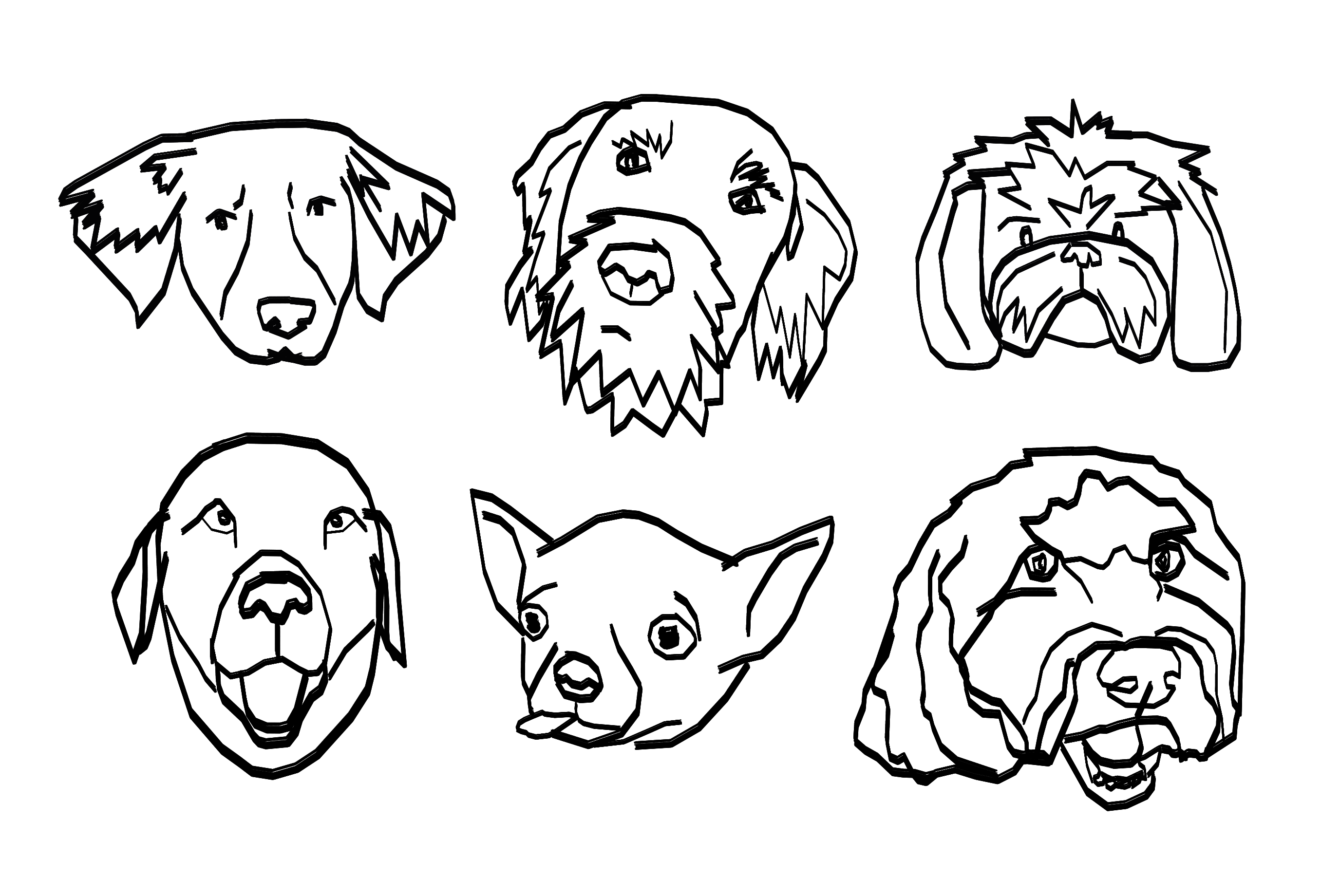
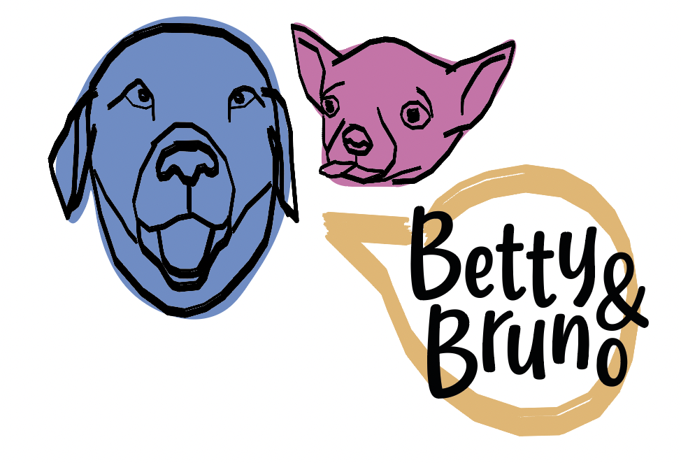
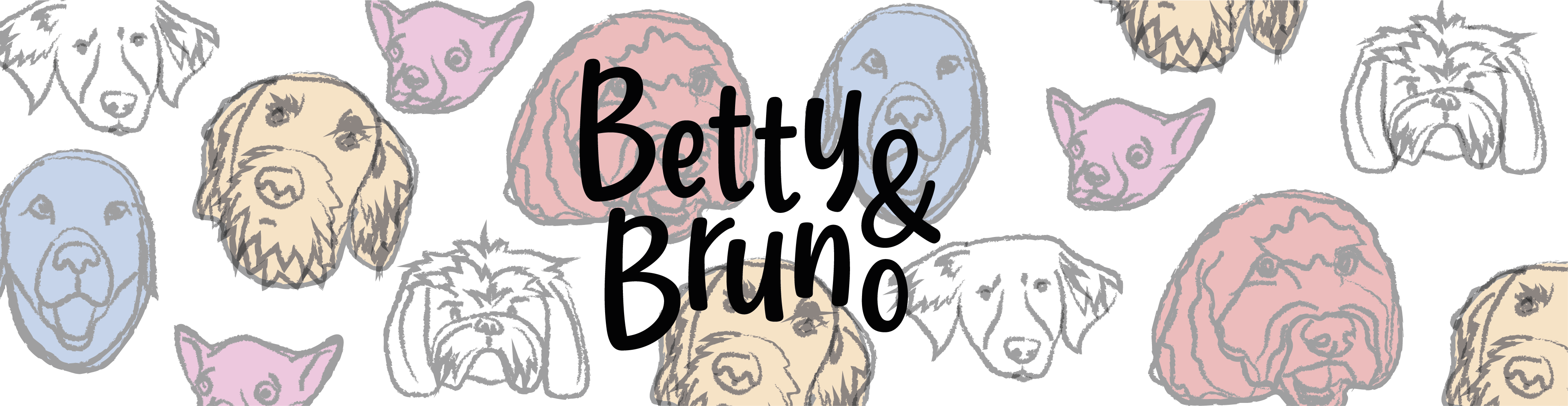
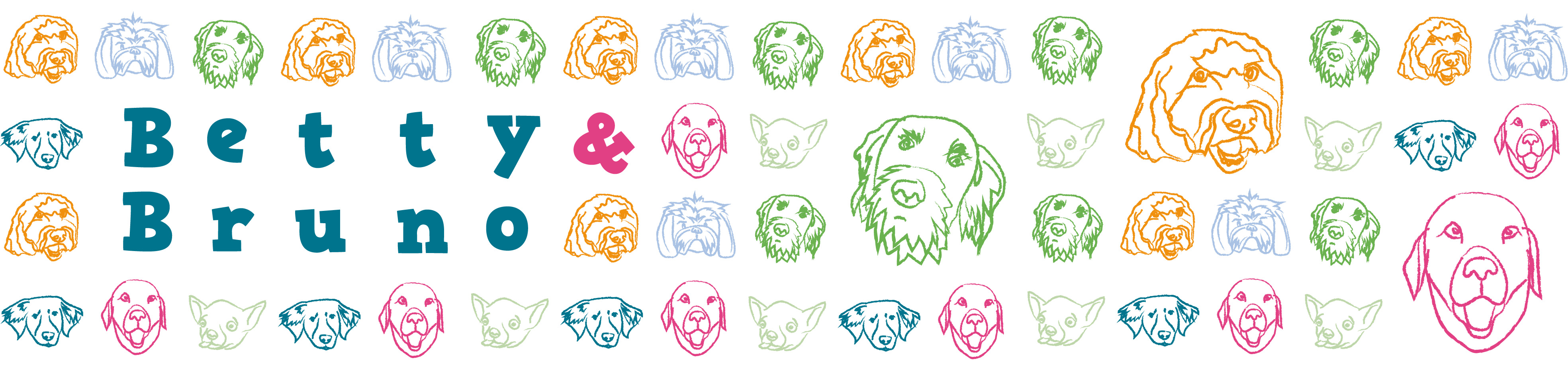
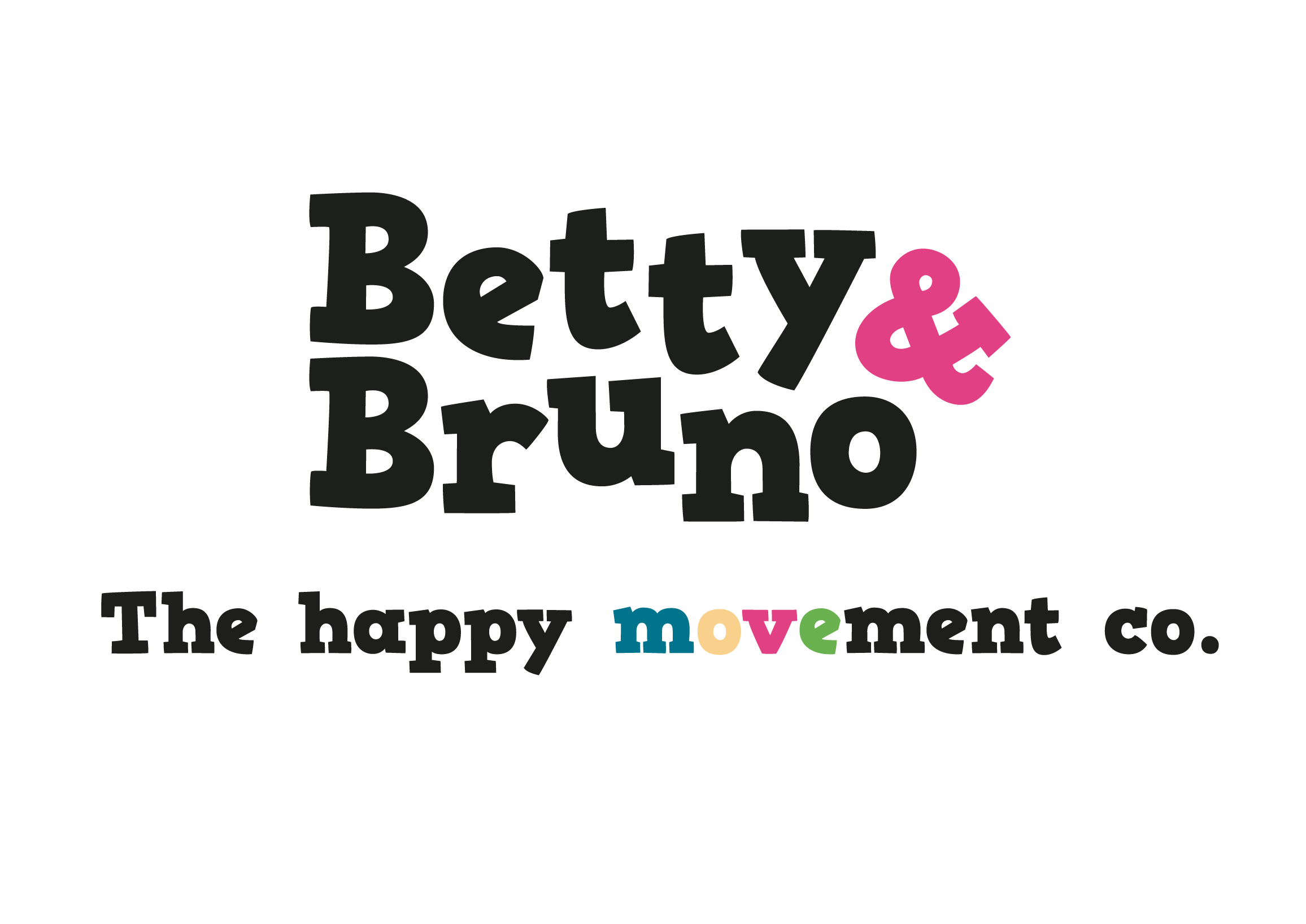
Our final logo features letters at different heights and a new strap-line, which both compliment the concept of movement. The colours of 'move' represent the brand colours also. By randomly layering the dog sketches, we created an abstract pattern whilst retaining the visuals of recognisable dog features. I think the pattern mimics the high energy and versatility of dogs, whilst the colour makes it both vibrant and modern.
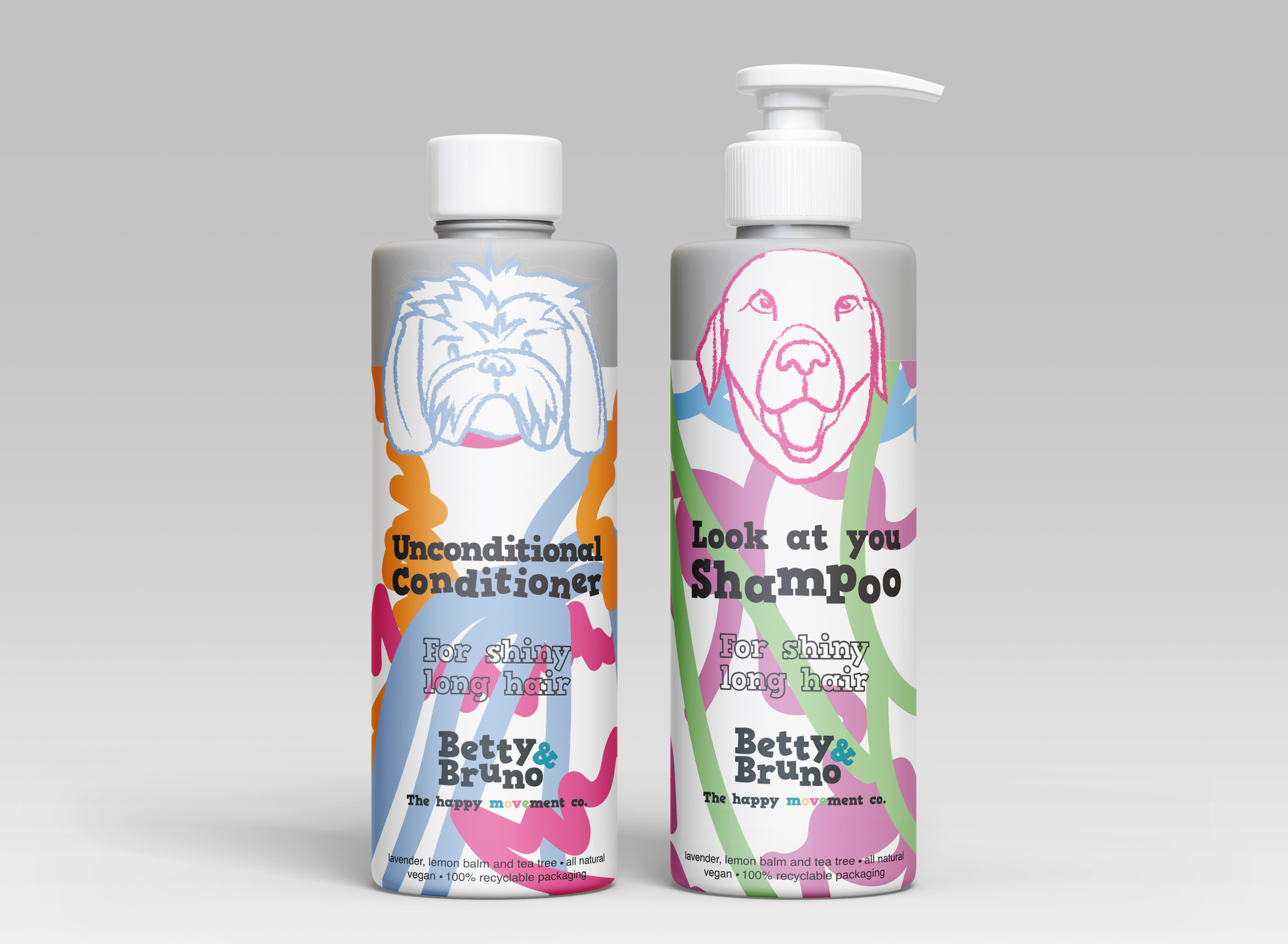
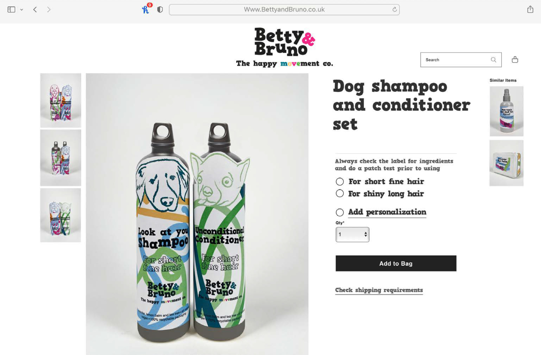
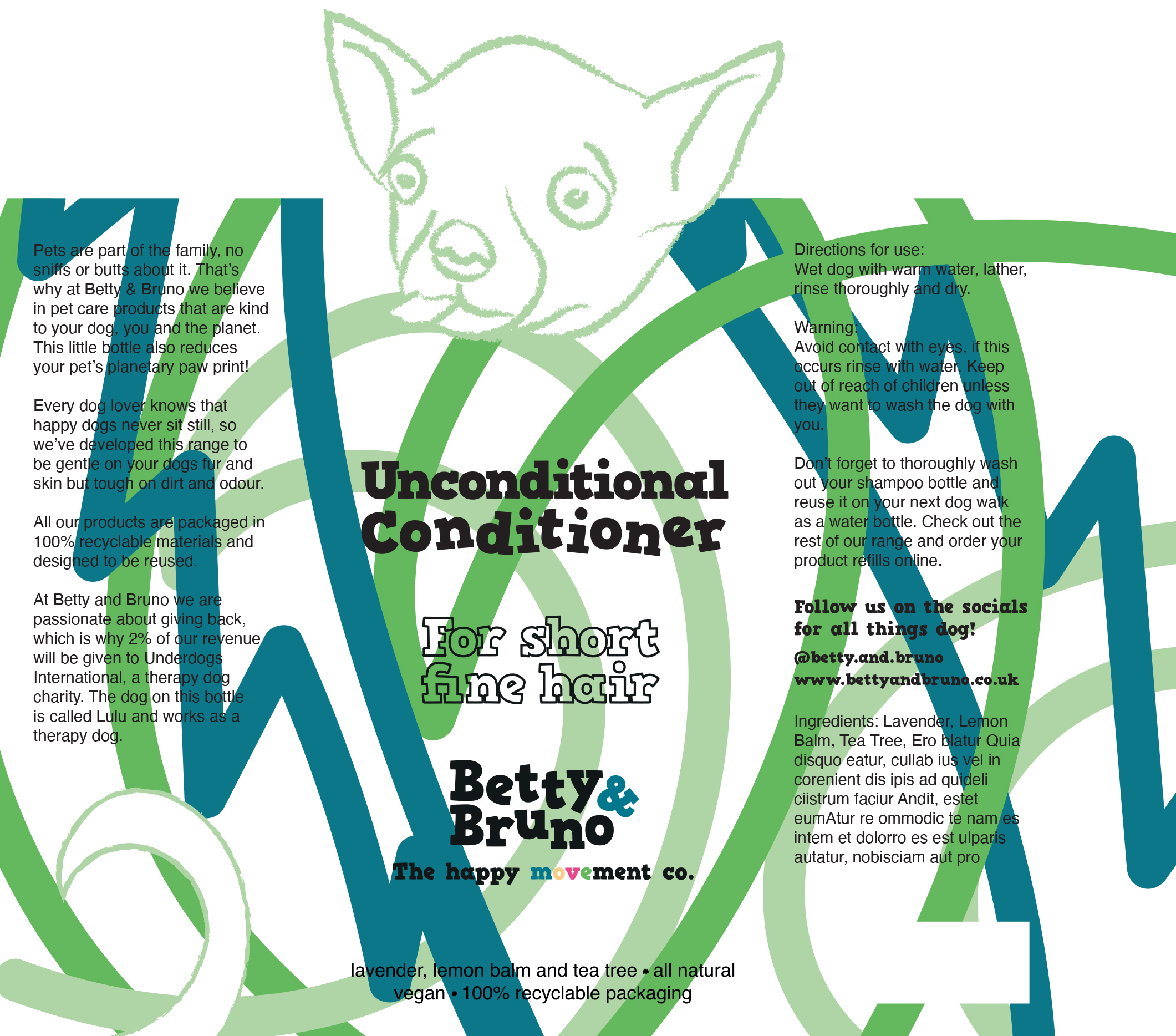
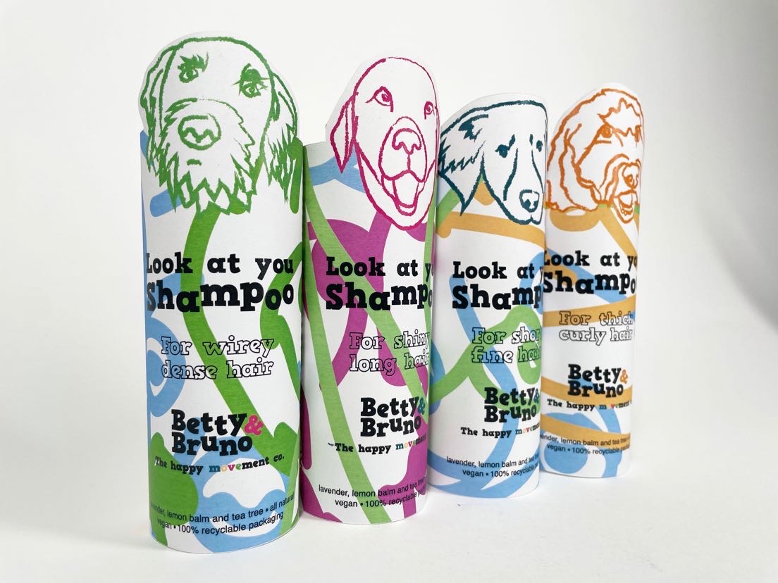
Next we assembled the shampoo bottle label, including the text and visuals we'd made so far. Our choice to have the dog's head as a cut out was due to the brief requirement to inject personality in to the brand.
After creating this label we decided the rough texture of our background image wasn't complimenting the style. We changed this to a smooth, rounded edge stroke which we felt worked much better.
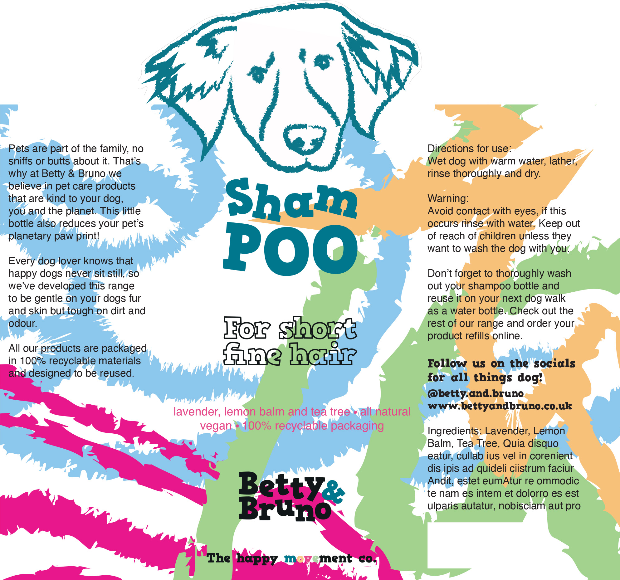
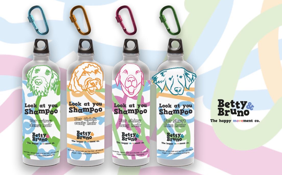
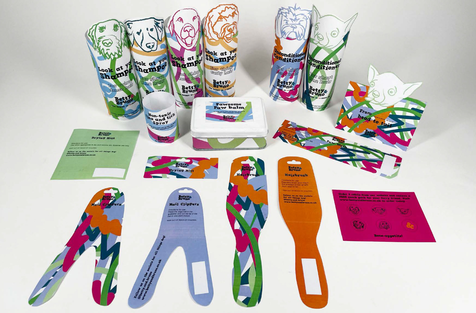
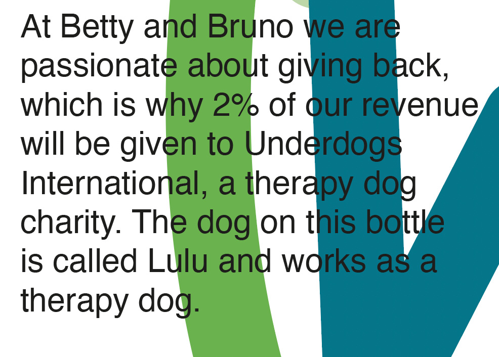
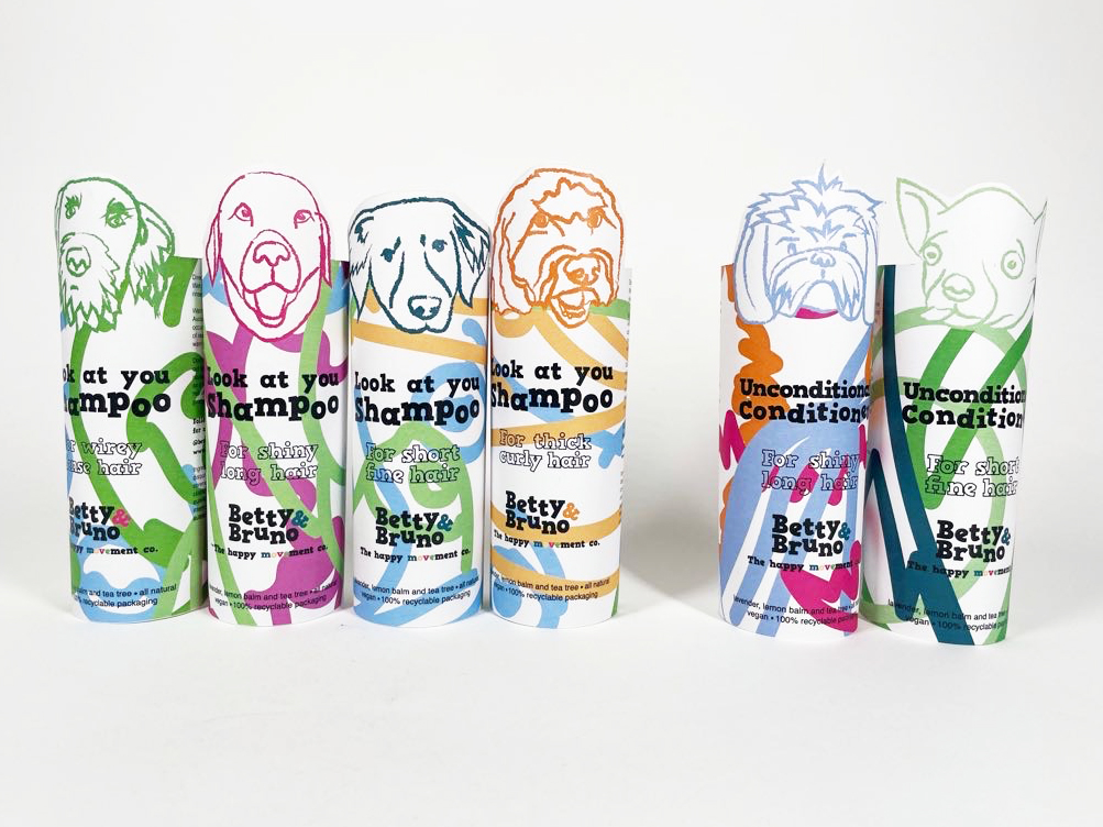
We had the idea of using a different therapy dog per bottle. This worked as it created a visual identity between the type of shampoo and the dog's hair type. We decided to include the brand's charity connection on the bottle, and also provide the name of the dog which creates a personal connection. Since we were using dog heads, we played on the idea of 'heads to tails' and included the tail on the back of the bottle.
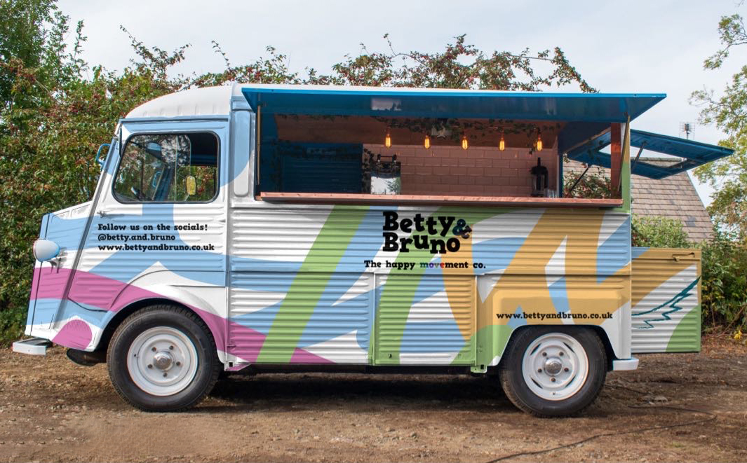
Our final brand identity is one that is versatile and developed. The colourful, abstract designs and sustainable aim mainly target the millennial generation, whilst our face to face interactions and high quality packaging can appeal to everyone. A potential launch event could be our mobile van at a popular dog show or event to maximise reach. The bottles are refillable and double as a water bottle with clip attached for dog walks.
Danielle and I worked well collaboratively, from conducting research and ideation initially to then constantly refining out ideas. I enjoyed this brief due to it being live and for a real client, it was a change to hear the brief set by the client and using only the information we were given at the start. I feel that we built a narrative for the brand, and this is reflected in the packaging and other touch points.
The insight we received of how dogs move was a concept we applied throughout and helped build a narrative for Betty & Bruno. I think our use of colour, pattern and form has designed an identity that stands out on the shelf and also aligns with sustainability goals.

Top