
Considering user experience, use HTML and CSS to code a website portfolio.
As Internet users only take 0.05 seconds to form an opinion of a website, I was meticulous with design and user experience. I wanted to create a website that was an extension of my personality; with bright colours and a friendly typeface. Importantly, the website design allows me to display my work and process in the best light.
As designing for the web is different to print, I looked at existing websites to understand the different elements. I was also looking at how they've designed for the user and the creativity I saw was inspiring- yet daunting!
I particularly liked the website for the design agency Media Monks who use animated rollovers and popups which appear when hovering. Their use of animation which is triggered by the user scrolling was fun to use. I explored the layout of their website and felt it was easy to navigate.
In a workshop, we looked at an agency website to explore how they use navigation. I looked at Bright Blue Day who use a top navigation section to access the main areas of their website. Their project pages contain a concise amount of information which is organised with headings and colour blocks. This activity in the workshop was a great insight into how crucial navigation is but also how it doesn't need to be overcomplicated.
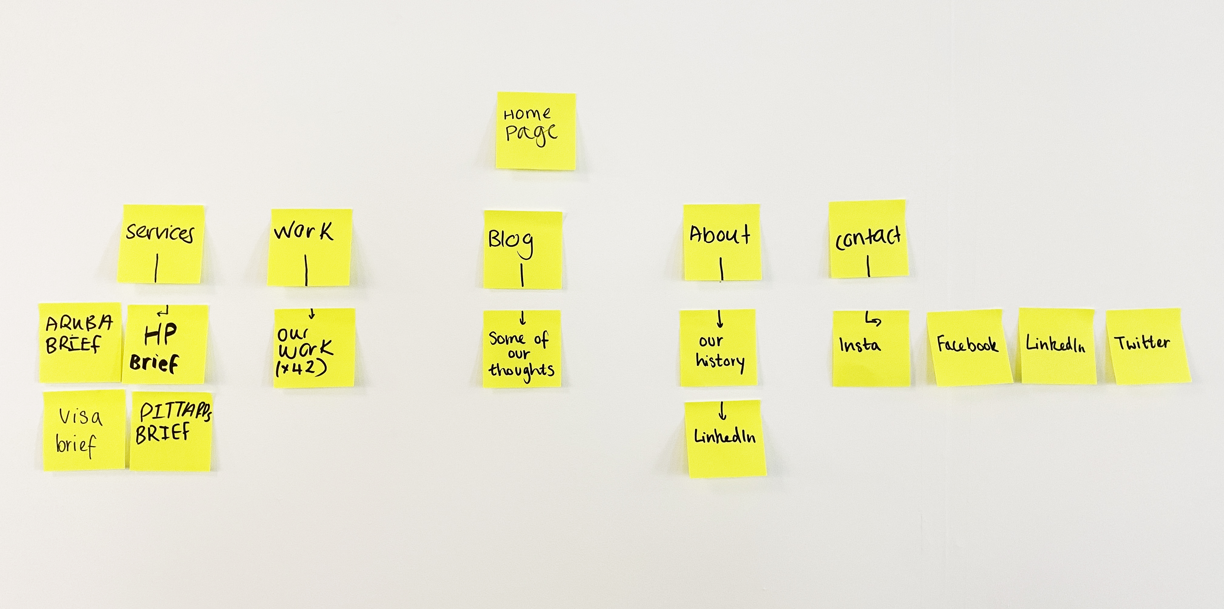
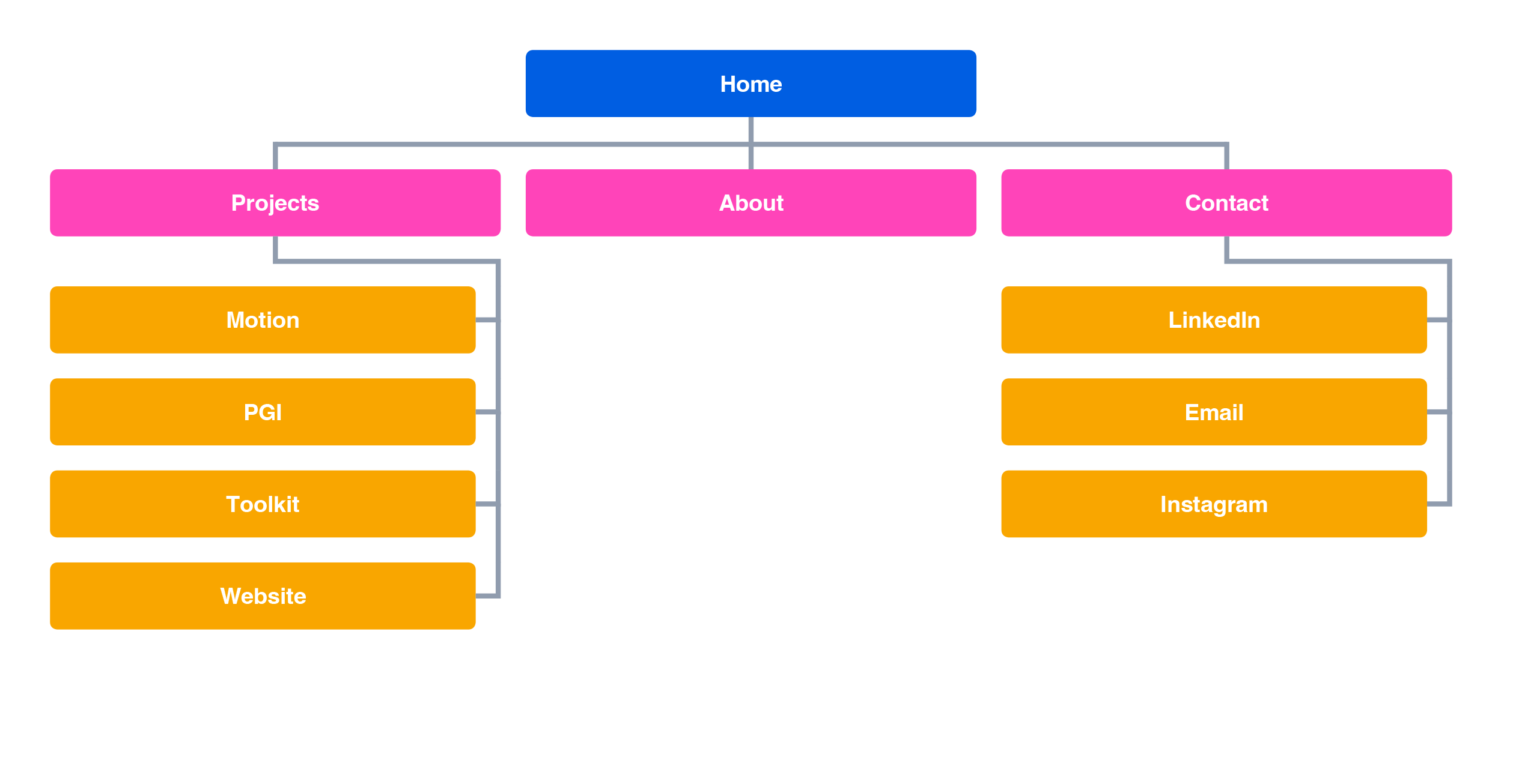
Using what I'd learnt about navigation, I created an overview of my pages and the routes to each section. Although simpler than the Bright Blue Day website, my work and contact content had a similer layout. This task helped me to map which pages would be linked together and plan a user's journey through my website.
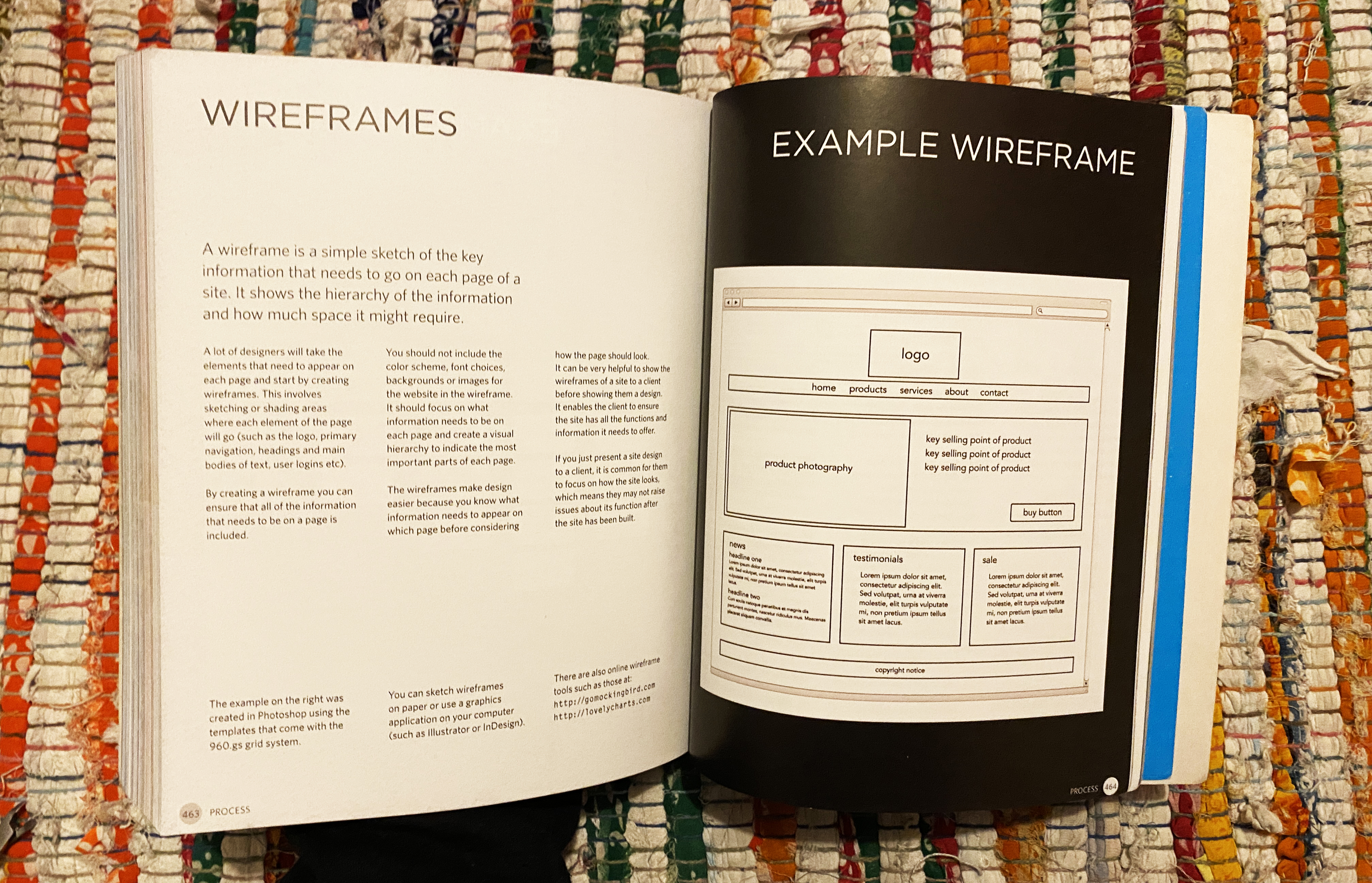
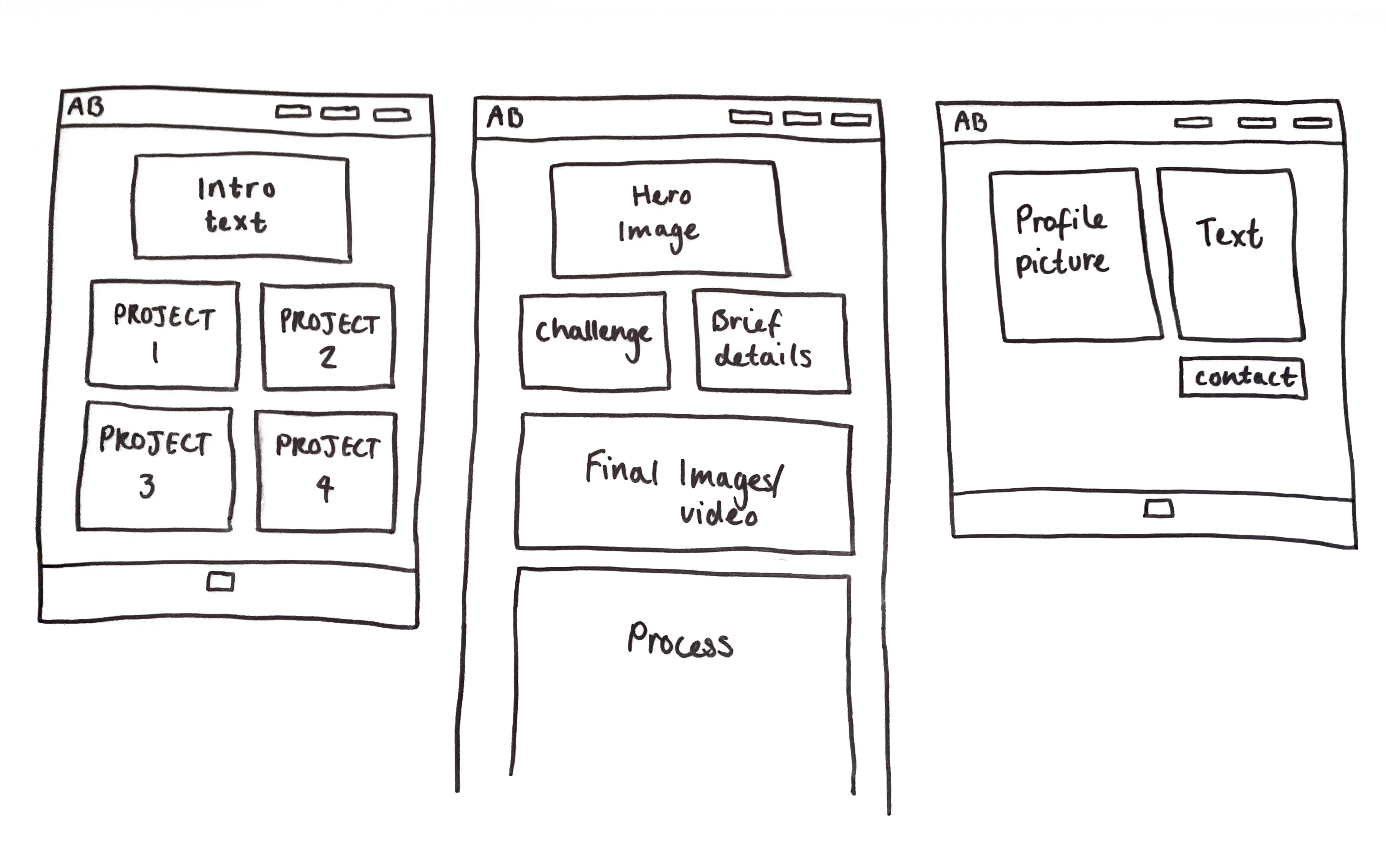
The book HTML & CSS by Jon Duckett was a valuable resource throughout this whole project. I used it at first to help me understand a wireframe, and then I was able to sketch out template layout ideas for my web pages. I sketched a layout for the three types of page on my website which were home, a project page and about.
I brainstormed the qualities about myself which I deemed suitable for the 'about me' section. I wanted my 'about me' to be a true reflection of my personality and design ethos.

I knew I wanted bright colours, so I explored analogous colour combinations on Adobe Colour. I chose the colour pink out of my colour palette to be the main colour for my branding, and this helps to create a visual system and allows for hierarchy in my text. For my typeface, I looked on Google Fonts and tried a few before choosing one which I liked. Josefin is geometric and sans-serif which I liked, and is a variable font so allows for hierarchy within my type.
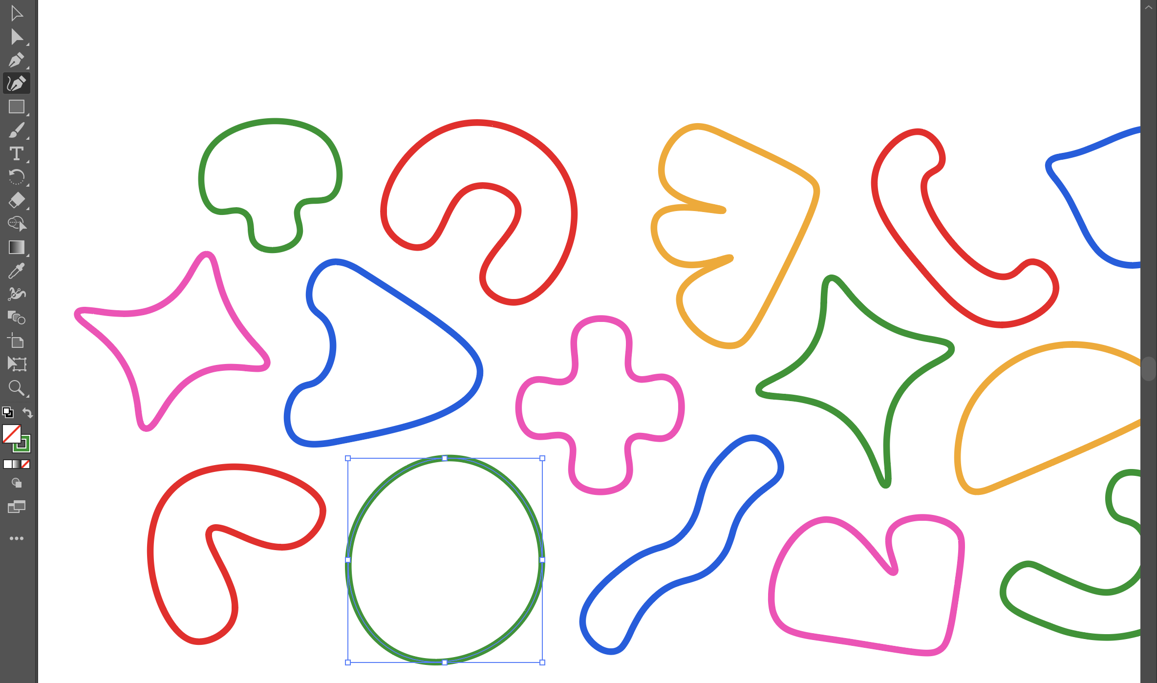
Building on my brand being an extension of my personality, I included hand-drawn vector shapes. The shapes are in a variety of subtle shapes that either represent something about me or coding. I arranged these in a pattern which has a fun yet considered style. Inspired by the rollover effects I found during my research, I had the idea to have my shapes represent the different navigation sections.


After doing a wireframe, I was able to map my content for each project on Figma. I considered what content to include to show my process best whilst also creating pace for the viewer with image size. As this is design for a screen, I edited my image content where necessary for example changing to RGB and adding brightness.
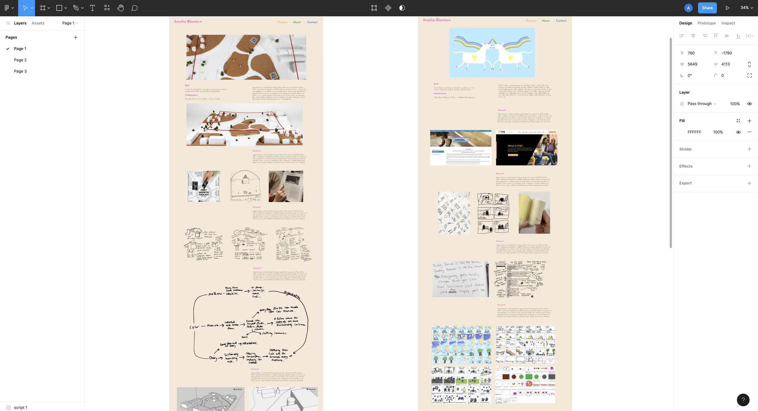
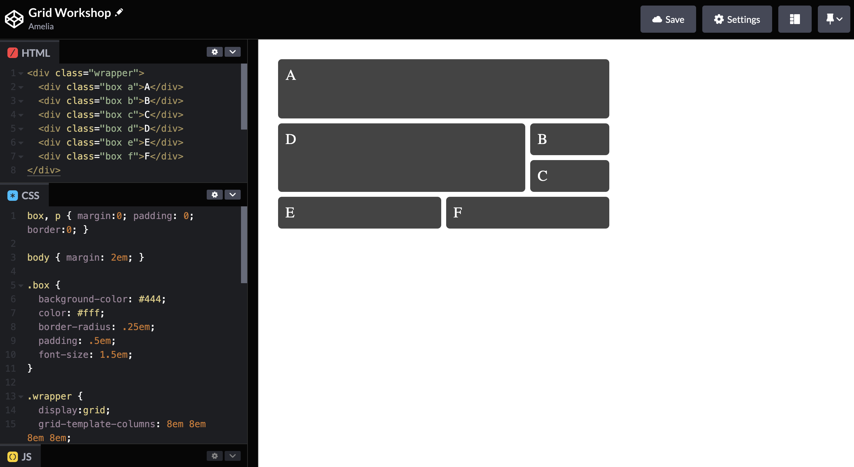
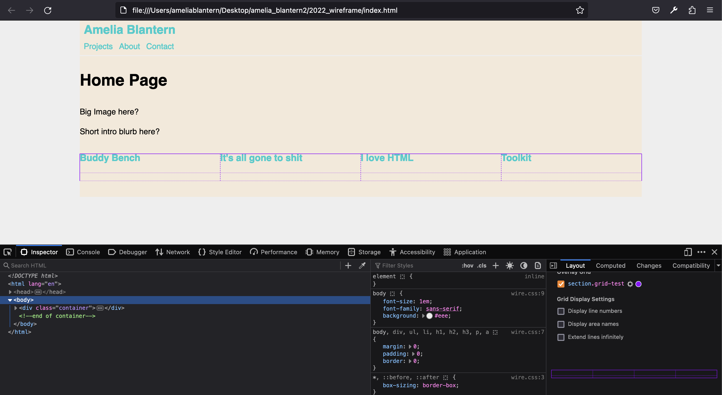
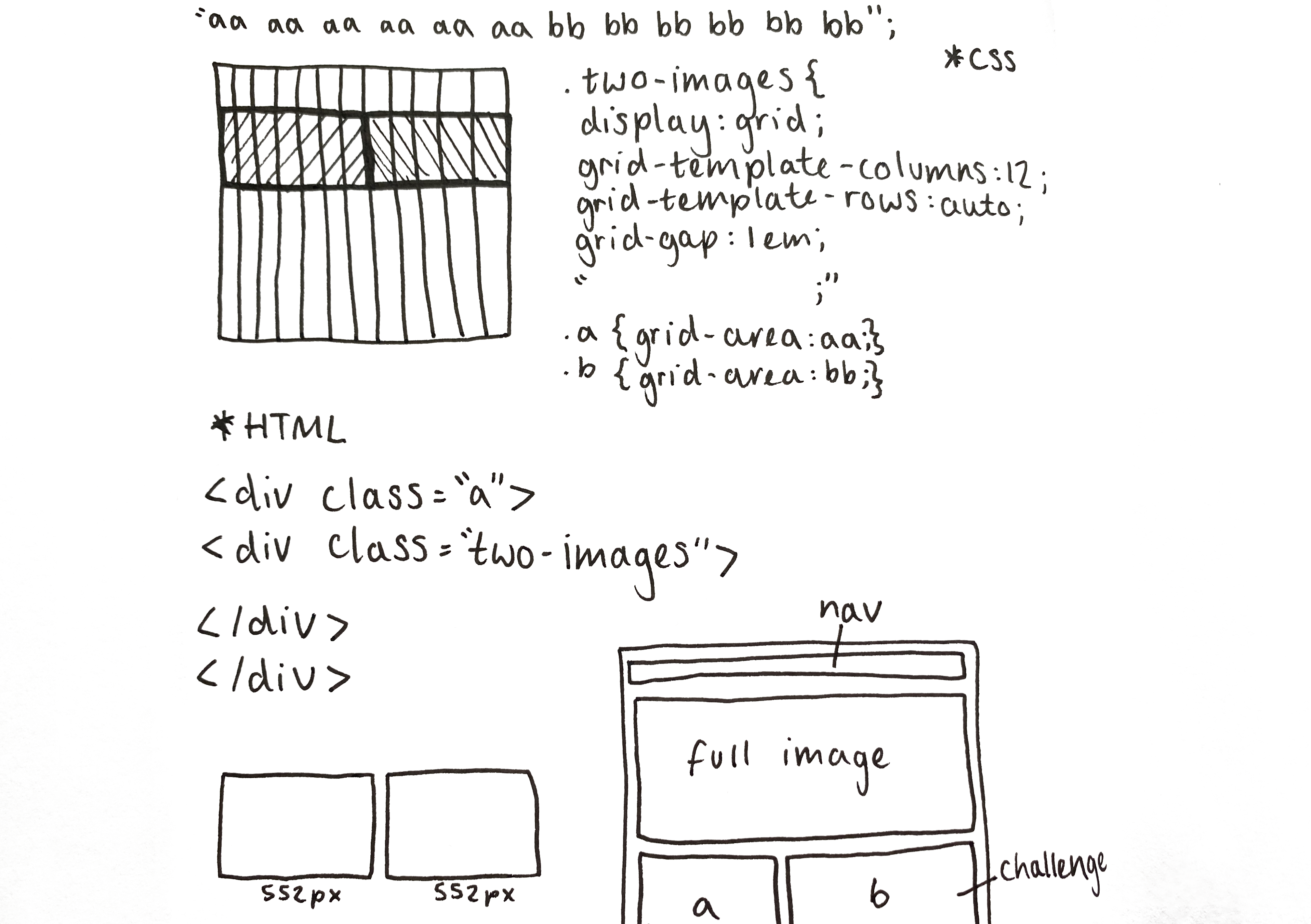
I was able to take my knowledge from the grid workshop and apply it to the content I had mapped out. This helped me pick a 12-column grid which allows me to have the variety of image sizes that I wanted. Using the 'Inspect Element' tool I was able to view my grid live which really helped my understanding, as grids were the most difficult part for me.
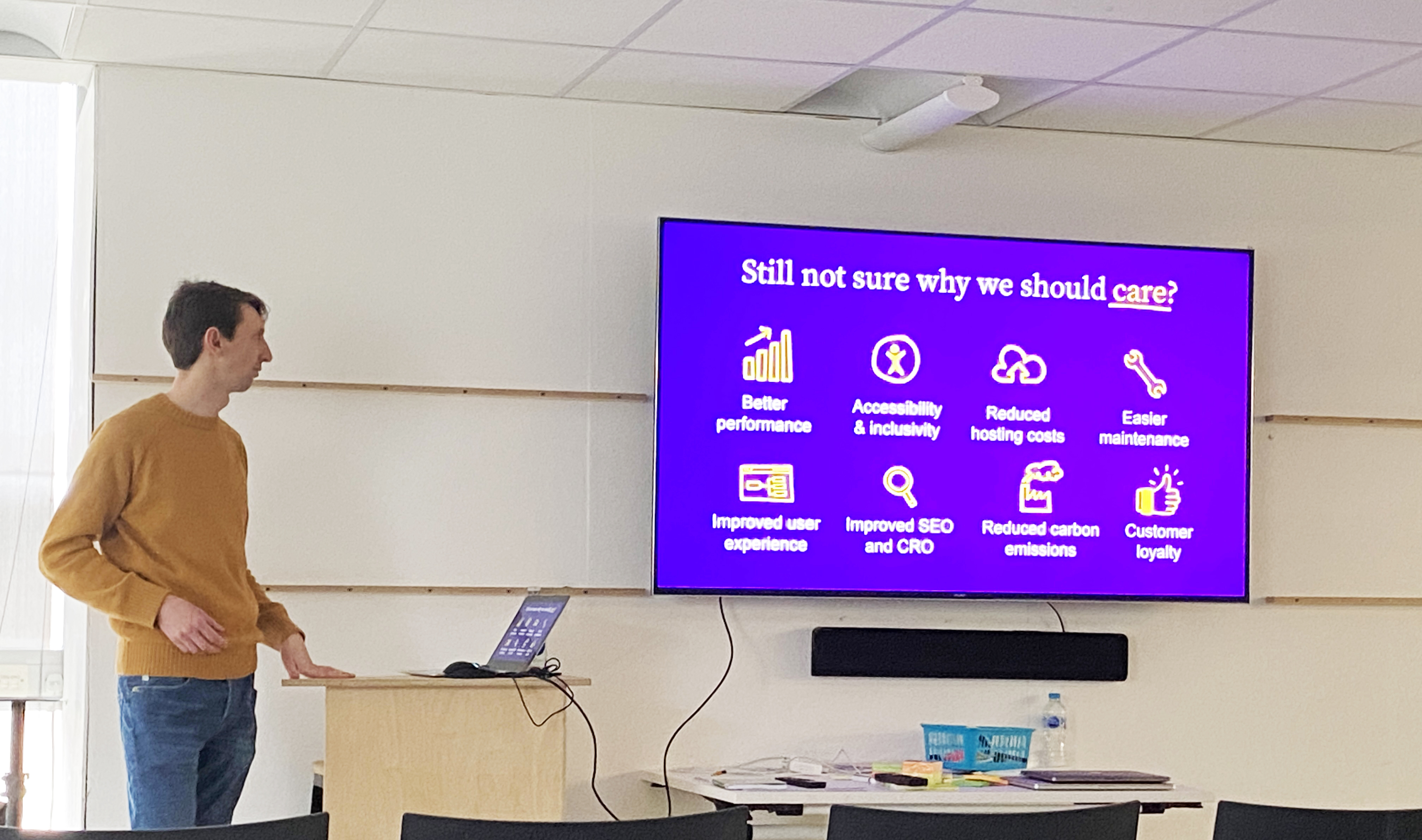
Tom Greenwood gave an informative talk on sustainable web design and things we can do to reduce the carbon footprint of our websites. I learnt the shocking fact that the internet is emitting more emissions globally than the aviation industry. To limit my contribution to this fact, I took measures like removing excess points from my vector shapes and condensing the amount of content.
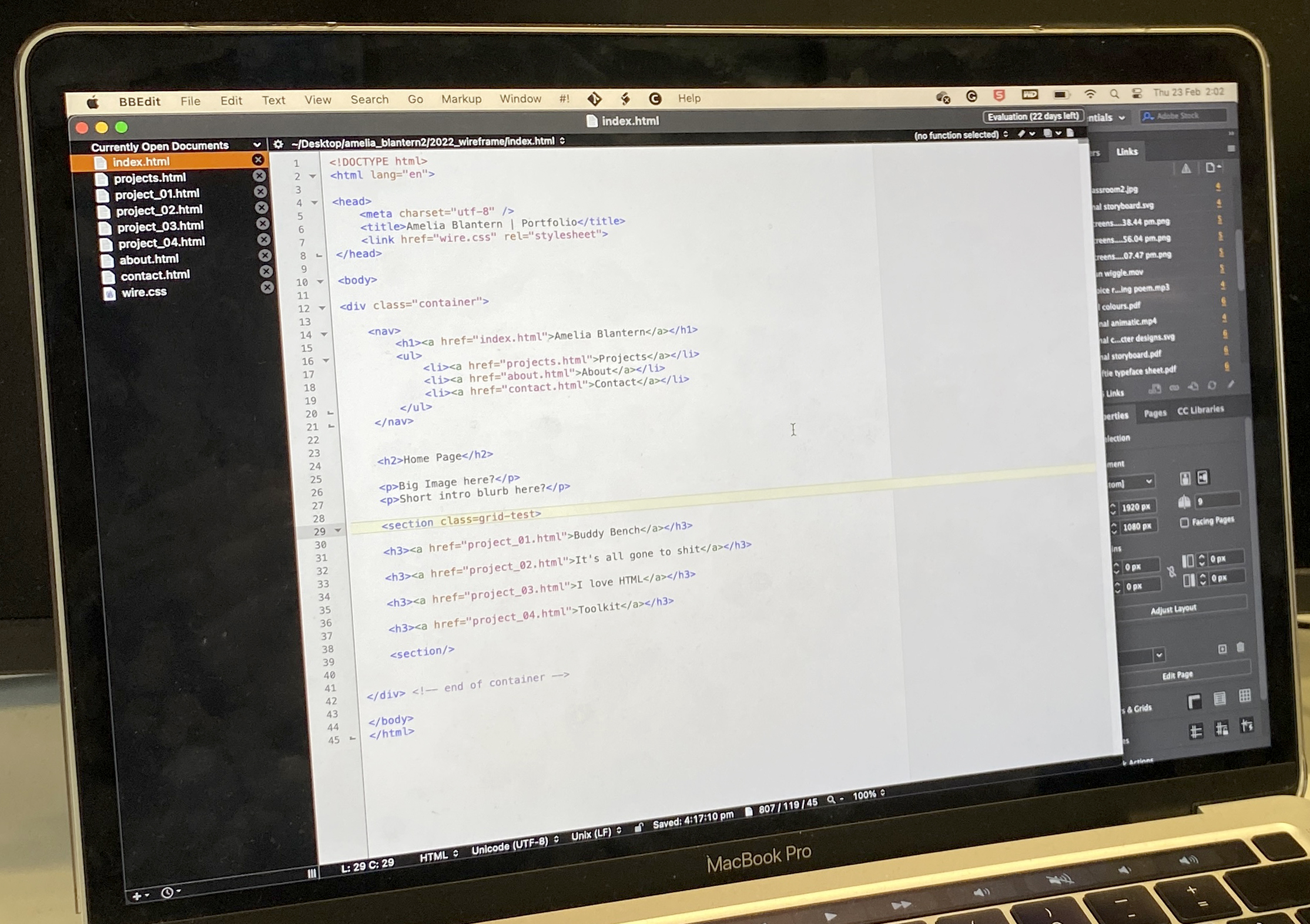
Using what I learnt in workshops as a base, I began coding. It took perseverance to learn the language of coding and I quickly learnt that a missing comma means a lot! The website W3Schools was a particularly helpful resource for explaining specific attributes. For example, I wanted to add hyperlinks on my contact page and found the relevant information on their website.
As I wasn't sure that the code I was writing would give me the result I wanted, using Codepen allowed me to test in real-time and helped me learn more efficiently. I worked systematically to get my content in and then moved on to testing and enhancing user experience with rollovers for example.
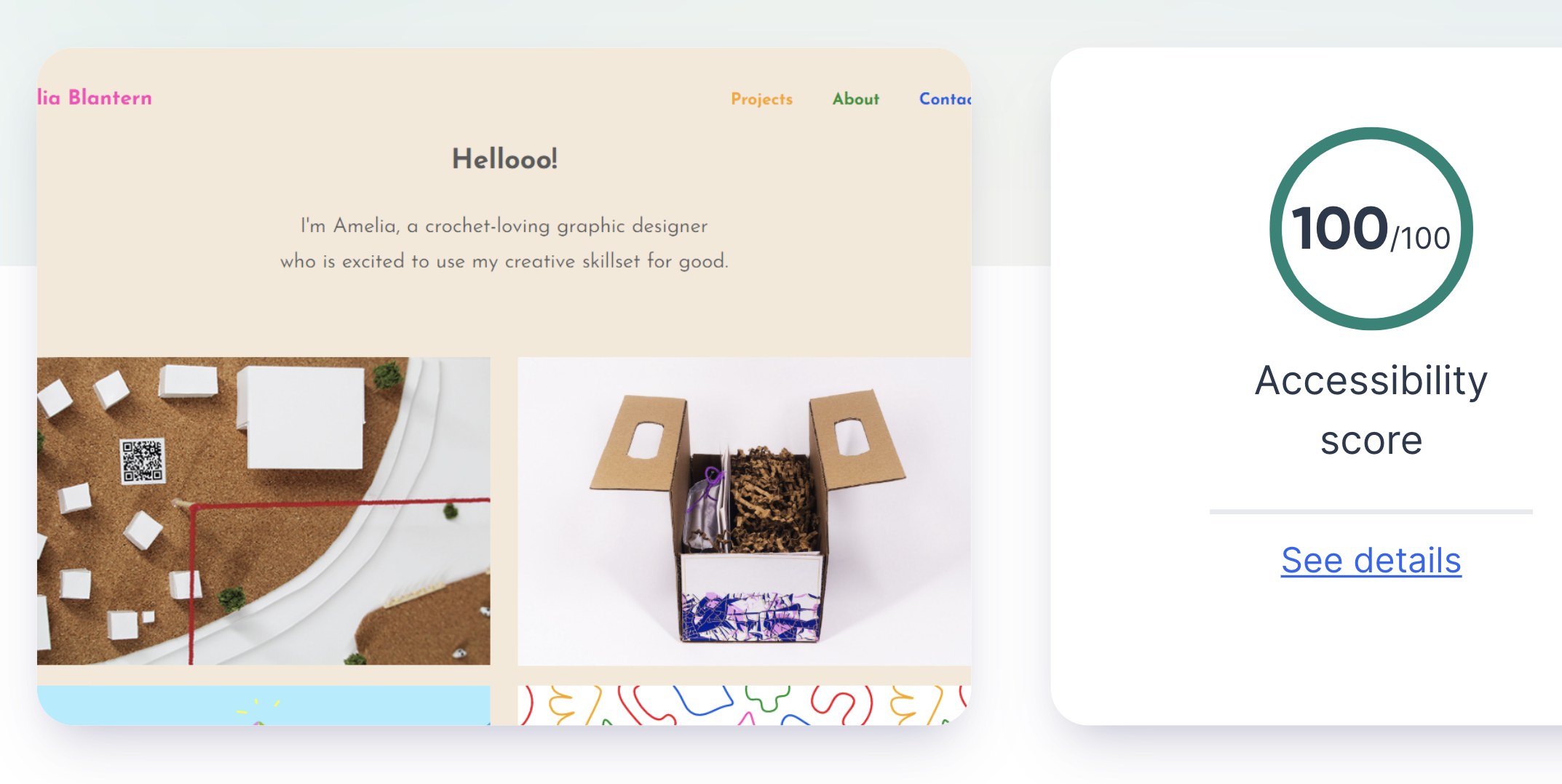
Making my website accessible was important to me so I took a variety of measures to ensure this. Using the tips from the Web Accessibility Initiative I tested the contrast of my colours, added image descriptions and used a consistent text hierarchy system. I then tested my accessibility at Site Improve and was pleased with my score.
User testing my website was particularly helpful in identifying areas to improve. They liked my navigation and design style, in particular my text hierarchy and project storytelling. The point for improvement I received was to change the image overlay's on my home page, as my colour scheme is bright and it feels too dark. The user testing session was a great opportunity to receive fresh insight and test the usability of my navigation.
From the user testing session, I realised I had a lot of content on my project pages. I created a link at the bottom of the pages which when clicked, takes you to the top. This saves the user time and as my main navigation bar is at the top, returning here is made easier.
I enjoyed the challenge of this project, as I had no previous experience with HTML or CSS. It was interesting to learn about coding and develop my skill set further. My biggest learning moment was understanding the grid and successfully being able to implement it to create the page layouts I wanted. I think the methods of help that I sourced were crucial to me producing the website that I have, particularly the book HTML & CSS by Jon Duckett which explains visually.
When adding the content of my projects, the narrative was something I considered thoroughly. Producing a flat plan with my images and text enabled me to outline the story I wanted to tell, and then vary the pace down the page. At all times of this process, I considered user experience and that helped me design the most appropriate website, by thinking about the target user. It was important to me to consider accessibility; I educated myself on the measures required which has developed my knowledge of designing accessibly.
The task of coding was rewarding as every hurdle I overcame, my website improved. This project has also greatly developed my understanding of designing for the web and web layouts. More specifically, understanding the challenges of designing for digital platforms and how to successfully create website page layouts. I plan to continuously update my website with new content and CSS features as I continue to learn.

Top